Monday, December 22, 2008

Assignment 2 (Final Work)

First, I was using a night day as my background and set as gray scale.
And then, I was apply the color/balance, brightness/contract and hue/saturation on my moon.
Third step, i was doing a borders by using effects - pattern overlay.
Next step, i was adding the "King's chair on it. I was cut out the chair by using the selection tool and choose grow/similar. And then, I was apply some gradient and effect - drop shadow on it.
And I create a light behind the chair which is using the lasso tool drawing the light shape, and then filter - render - clouds to apply the color. Before that you have to select the color properly (foreground and background). With the Gaussian blur effect, the light looks more true.
After that, I was adding a group of executive image on it. I was using the selection tool to select the group of executive from a picture (grow/similar), and i delete the inner color from the executive by the replacement of the management building. Which is using mask tool to combine it. At last I was apply effect - Inner glow and stroke.
Finally, I was applying all the information on my digital wallpaper by using text tool. With the effect of drop shadow, inner shadow, outer glow, color overlay and stroke.

Here is my final works of my digital wallpaper.

Project Charter for Assignment2 (Final Work)

Project Charter Assignment 2

Assignment 1 Title: Digital Wallpaper.

Project Start Date: 05 December, 2008.

Project Finish Date: 02 January, 2008.

Project Manager: Lau Sai Fong

HP: Please refer MMLS

Email: Please refer MMLS

Website: http://mcg1014-1071120519.blogspot.com/

Project Objective: Faculty of Management (FOM) is located next to the HR building, Multimedia University at Cyberjaya Campus. It is one of the seven faculties in the University. Its aim is to provide and maintain an environment conducive towards independent learning, research and intellectual enquiry, with emphasis on the changing needs of the new millennium. And today, I have created and design wallpaper for FOM open day.

Approach: I would like to create wallpaper for my own faculty that is FOM by using the image of “King’s Chair”. The purpose I using this image is because King is a leader during the old time. And FOM is the “King” which is the biggest and most many students in MMU. Besides that, “chair” is to represent welcome all the people come and visit our open day.

I’ve use some images to represent the faculty of management. For example a group of management people. And the people who welcoming, are invited to sit on our “chair” which’s means join MMU. In this wallpaper, I will show out the ability of a FOM student which is field in coloring, ideation and imagination. Which’s mean, FOM student also can have the talent in area of coloring, ideation and imagination.

In the additional, I join up the management and a management building together. And I was using a night time with a big moon as my background. It is because I want to make my wallpaper come out some mystery feel. It’s because the mystery, and all the visitor will be attract to our FOM open day.

The tool that I using during I modify my wallpaper is tool of brightness/contract, Gaussian Blur, stroke, color, hue/saturation, text (font and etc), blending skill which is feather and gradient and others function tool. Besides that, I had used the selection tool to select certain images. For some application, I had created a “light” behind my “executives” which assist by Render tool.

Roles and Responsibilities:

I will start my work on 05 of December for my research images. And the continuous day I will start to modify my post card in Photoshop CS3. 09 December is my proposal of my assignment 2, and I show out my first stage of my assignment to my tutor. And 02 of January is my submission of my Assignment 2.

1. “Students are to submit the original PSD files (DO NOT FLATTEN THE FILE) together with the images used in the wallpaper. Call the file StudID_asssignment2.psd”.

2. “Place the files in separate folders. One folder containing the PSD file called Wallpaper. The other images used are to be placed in a folder call Wallpaper_ref”.

3. Print the wallpaper. Postcard size is A4 with 300 resolutions.

Comment: Photoshop is totally different with Illustrator... But I will try my best to accomplish those hard works in Photoshop.

And the picture at the below is my reference:


Saturday, December 20, 2008

Tutorial 6 for MCG 1024

Open the fabric.tif and duplicate it. After that set it as gray scale and save it. The purpose to duplicate another fabric picture is because to make the words on the fabric have the same effect with the fabric.
Now, we gonna do is to create shadow on an object. Just make some strike on the background and repeat the step just now, which is duplicate the image and displace the image on it.
It's going to apply the same effect with the tutorial 5, but this time we will add on the color on it to become likely to marble.
Create a new layer and preparing for the lighting effects.
After the lighting effect, we also add on the clouds and noise effect.
Here is the another effect which is glass effect.
After applying the stoke, Gaussian blur effect; it was preparing the blending mode.
After the blending with using the calculation, and we also adjusting the curve of the images. We invert it too.
We just blend a image together with the object, and then apply the hue/saturation effect, curve and Gaussian Blur effect on it. And we can also adjust the color due with personal preference.
Apply the shadow effect on it in the end.

Friday, December 12, 2008

Tutorial 5 for MCG 1024


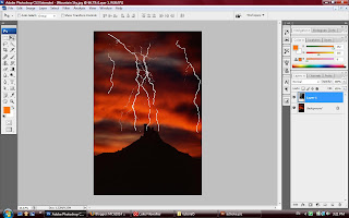
Today is gonna learn about layer blending, just open the lighting.tif and mountain sky.jpg for the blending. Just click on the layer style for the blending option, adjust the coloring to blend this two picture.


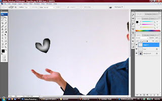
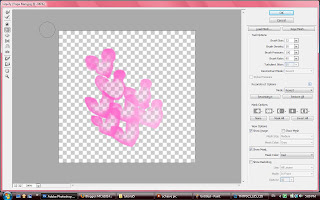
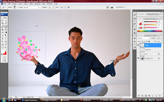
And now, i going to create an object on the hand for the yogaman.jpg. First of all, i gonna roughly draw any object by using Lasso tool and click ctrl+backspace to delete the space with a new layer. Now, you will using the paint brush for the coloring. After done all the job, you can define the brush style and save it.


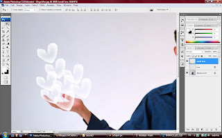
And now, u create a new layer again for the other object. We can use the brush style that we create just now from the brush option.


We gonna add some color on the small diamond. First we create a new layer, and create a square shape by using marquee tool. Set the color for the foreground and background then go for the render -> clouds. Just apply this effect on the small diamond. By the way, you can adjust the color through using the Level option.


You can adjust the shape with the Filter -> Liquify. And now, i already change my LOVE shape to become MICKEY.


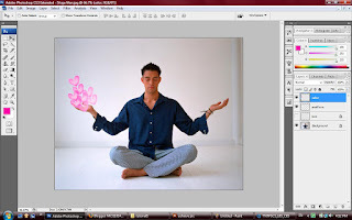
If you wanna add others LOVE shape on it, just click on the brush with adjusting the opacity.


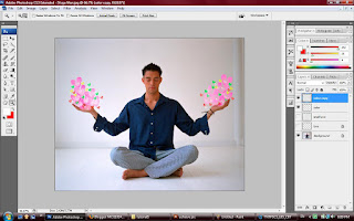
Just drag another copy to the other hand, and edit it.


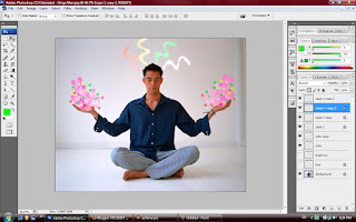
If you wanna create another things on it, just repeat the same step on it.

Wednesday, December 10, 2008

Project Charter for Assignment2 (Proposal)

Project Charter Assignment 2

Assignment 1 Title: Digital Wallpaper.

Project Start Date: 05 December, 2008.

Project Finish Date: 02 January, 2008.

Project Manager: Lau Sai Fong

HP: Please refer MMLS

Email: Please refer MMLS

Website: http://mcg1014-1071120519.blogspot.com/

Project Objective: Faculty of Management (FOM) is located next to the HR building, Multimedia University at Cyberjaya Campus. It is one of the seven faculties in the University. Its aim is to provide and maintain an environment conducive towards independent learning, research and intellectual enquiry, with emphasis on the changing needs of the new millennium. And today, I have created and design wallpaper for FOM open day.

Approach: I would like to create wallpaper for my own faculty that is FOM by using the image of FOM building. Besides that, I will apply some colorful design, stoke on my wallpaper.

I might use some images to represent the faculty of management. For example office, paper and so on. In this wallpaper, I will show out the powerful of the FOM which is the coloring, ideation and imagination. Which is mean, FOM student can have the talent of the coloring, ideation and imagination.

Grading for this assignment 2 is regarding for the idea and message, use of tools, quality for the digital images, and creative / imaginative / design of the wallpaper.

The tool that I using during I modify my wallpaper is tool of brightness/contract, Gaussian Blur, stroke, color, hue/saturation, text (font and etc), blending skill which is feather and gradient and others function tool.

Roles and Responsibilities:

I will start my work on 05 of December for my research images. And the continuous day I will start to modify my post card in Photoshop CS3. 09 December is my proposal of my assignment 2, and I show out my first stage of my assignment to my tutor. And 02 of January is my submission of my Assignment 2.

1. “Students are to submit the original PSD files (DO NOT FLATTEN THE FILE) together with the images used in the wallpaper. Call the file StudID_asssignment2.psd”.

2. “Place the files in separate folders. One folder containing the PSD file called Wallpaper. The other images used are to be placed in a folder call Wallpaper_ref”.

3. Print the wallpaper. Postcard size is A4 with 300 resolutions.

Comment: Photoshop is totally different with Illustrator... But I will try my best to accomplish those hard works in Photoshop.

Assignment 2 (Proposal)


Here is my first production for my assignment 2. And i had use the same tool in assignment 1, in additional i had try all the style in LAYER style, every BLENDING MODE and also the SMART FILTER.

For the further improvement, I will try more tools to finalize my assignment 2.

Friday, December 5, 2008

Tutorial 4 for MCG 1024 H


39) Back to the MOVE TOOL and bring out the LAYER STYLE again.
40) Go to the BLENDING option on the top, turn on the BLEND INTERIOR EFFECTS AS GROUP and also adjust the opacity to become lower and press OK.
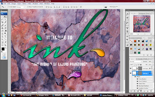
41) Now, we have a ice effect on the picture and the whole picture was done.

Thursday, December 4, 2008

Tutorial 4 for MCG 1024 G


33) And we can also add the new layer style and rename it.
34) Choose the background again, and go to the TOOL PALLET with choosing the RECTANGLE TOOL. Double check the option bar by clicking the SHAPE LAYERS.
35) Just click and drag on the outside of the background, what we gonna to do is, apply the new style that we create just now.
36) For additional edit, just click on the NEW MASK on the shape layer.
37) Just click on the LAYER MASK and press ctrl + backspace.
38) The purpose we do it, it's because we need to use the paint BRUSH TOOL to paint the part that we would like to paint on.

Tutorial 4 for MCG 1024 F


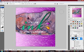
23) If you don't like the style u can click on the LAYER PALLET choose gradient and edit it.
24) We are doing some texture on it right now, just turn off all the visibility of the words, and choose background for editing.
25) Go to the CHANNEL, create a new layer for GREEN. The purpose we gonna do it it's because if we don't wan the GREEN after we edit, at least we have another copy backup.
26) Now, come to the FILTER click on BLUR and choose GAUSSIAN BLUR. Just adjust the pixels as you like.
27) And you can control your level by clicking ctrl + L, there are four button to let you move on.
28) To select the whole object just press on the ctrl + A, and now we gonna to save it up by name rust with the EDIT and click on DEFINE PATTERN.
29) Once again, de-select and turn on the visibility RGB and also the visibility of the words.
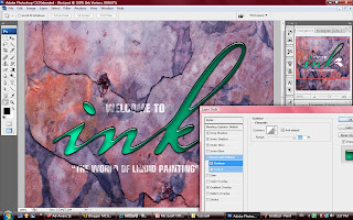
30) Is time for the texture editing, just select the object click on the layer style for the edit. Go to the BEVEL and EMBOSS and turn on the TEXTURE.
31) Select the pattern that we just create and adjust the SCALE and DEPTH. Turn off the LINK WITH LAYER that mean the texture will fix to the background. And the most important is must click on the SNAP TO ORIGIN make sure all the align will fix with background.
32) And now, you can simply drag on the object move around, and the align will follow the background changed.

Tutorial 4 for MCG 1024 E


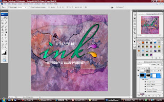
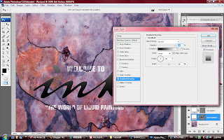
21) If you really like the style of your "ink" words, you can create a new style inside your STYLE pallet. Just click and drag and rename it.
22) And now, you can apply the exact same style on your others object or words.

Tutorial 4 for MCG 1024 D


16) Now, is change the bevel effect. Come down choose the BEVEL AND EMBOSS.
17) Make sure we are choosing the INNER BEVEL from style and the SMOOTH from the technique.
18) You can change the ATTITUDE to show out where was the light come from to your liquid, it'll make your object become more nicer.
19) You can adjust the OPACITY for the HIGHLIGHT MODE and the SHADOW MODE too.
20) A funny things is, you can come to the CONTOUR and turn it on, now you will see the highlight of your object changed. For extra adjusting, you can turn on the ANTI-ALIASED and set the RANGE.

Tutorial 4 for MCG 1024 C


10) After done for the gradient of the "ink" words, go to the INNER SHADOW to edit.
11) Just edit the opacity, angle, distance and size by your reference.
12) Now, it's come to the DROP SHADOW for your editing.
13) Repeat the step 11 on it. The different between INNER SHADOW and DROP SHADOW is one is the shadow inside the object and the another one is shadow outside the object.
14) Now, come to the OUTER GLOW. To apply another drop shadow, just choose the black color and change the BLEND MODE to multiply, and you'll see it.
15) You can also adjust the opacity and size from the OUTER GLOW with your preference.

Tutorial 4 for MCG 1024 B


6) Now, we get to see the "ink" words it's already have some gradient effect on it which is from white to black color.
7) To change the color, click on the GRADIENT box and it will appear box name GRADIENT EDITOR, inside the box we can go through the gradient bar double-click on the black color COLOR STOP to choose any color.
8) After you choose a color, do the same things on white color COLOR STOP too, but this time you have to choose a light color on it and click OK.
9) And now, you can choose the ANGLE to display your color from different angle.

Tutorial 4 for MCG 1024 A


1) Browse and find a file call rust.psd, then open it.
2) Press F for the full screen and make sure the picture is on the center.
3) Go to LAYER and click on the "ink" words and choose the right hand side box which is VECTOR MASK THUMBNAIL.
4) And then go to the VIEW click on ACTUAL PIXELS. What we gonna to do is change the "ink" word's color.
5) Go to the LAYER PALLET, and choose LAYER STYLE and click on GRADIENT OVERLAY.

Friday, November 28, 2008

Tutorial 3 for MCG 1024 H


45)pull the layer2 to the above of the background
46)turn off the visibility for all the layer1, except the original layer1
47)there's a shortcut, press the alt key between layer 1 and 2 and click on it, it will group this two layer.
48)on all the visibility back, apply same method on it to group all together.
49)now, the works is done.

Tutorial 3 for MCG 1024 G


36)open the Vancouver.tif, then go to the channel pallet choose the alpha1.
37)open the twenty.jpg again, click and drag to the Vancouver.tif.
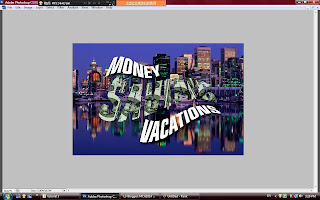
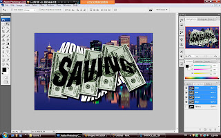
38)go to the channel pallet, click on the visibility of the alpha1 it will show out the "savings" words on the twenty picture.
39)click on the ctrl + T for the transform, you will rotate and resize the twenty picture on the "savings" words.
40)after rotate, click on the layer style and apply drop shadow, set the distance as you like and click OK.
41)now, is copy and paste function, just hold down the alt key and drag another picture come out. free transform and click ENTER.
42)repeat step 41 again and apply to all of the "savings" words.
43)go to the CHANNEL pallet, click on the ctrl key on the alpha1 to make a selection
44)back to the LAYER PALLET, create a new layer, then click on alt + backspace to delete.

Tutorial 3 for MCG 1024 F


33)double click on the layer1 and it will appear a layer style box
34)set the underlying layer to become 25, hold down the alt key you can set another 75 on it and click OK.
35)press the TAB key to show full screen picture on it

Tutorial 3 for MCG 1024 E


24)for a easy way, back to PATH click on the BOOK TITLE with ctrl key to select.
25)go to the CHANNEL and create a brand new channel - alpha2
26)just click on the alpha2, and press X key to switch foreground to background
27)go to the EDIT menu and choose STROKE, set 10px and center then press OK.
28)go to the FILTER and click BRUSH STROKE choose SPATTER, we just need to re-set the smoothness and spray radius as own preference.
29)back to the CHANNEL, turn on the visibility for RGB, turn off the visibility for alpha2.
30)press ctrl by clicking the alpha2 make the selection, and back to the LAYER PALLET.
31)ctrl + shift + i to invert, alt + backspace to fill up the effect.
32)ctrl + d to de-select it and you will see the beautiful effect on it.

Tutorial 3 for MCG 1024 D


20)ctrl + L to bring out the LEVEL set the construct depending on your preference.
21)back to the RGB and make the selection by clicking ctrl + alpha1
22)back to the LAYER PALLET, make sure select the layer1 and click on new layer mask
23)to see the effect that we making just now, make sure you click on the layer mask icon, and click ctrl + i to invert it, and it will show out all the effect.

Tutorial 3 for MCG 1024 C


16)go to FILTER, choose PIXELATE and click on MEZZOTINT, it will appear a box.
17)inside the MEZZOTINT box, u can select what ever you want at TYPE.
18)and i choose SHORT LINES, click OK and you will see the whole picture are become short line effect.
19)go to the FILTER again, choose on BLUR and click on GAUSSIAN BLUR and set the pixel to 1.3, after done click OK and you will see the effect.

Tutorial 3 for MCG 1024 B


8)come to the CHANNEL PALLET to the right hand side, create a new alpha channel.
9)it will show whole black color on the screen, turn on the visibility on the RGB.
10)zoom in (100%, and pull down to words.
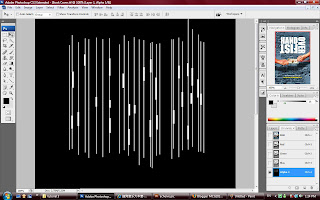
11)go to the shape tool to select the LINE TOOL, and the option bar click on FILL IN THE PIXELS
12)press X key to exchange the foreground and the background, go to the option bar change the weight to 2px.
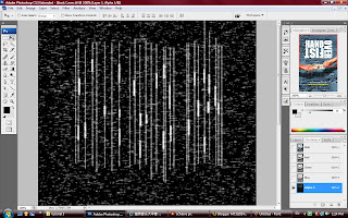
13)draw the line cross all the words with SHIFT key.
14)after complete drawing the line, change the weight to 6px, and hold the SHIFT key again for drawing few shortest line on the words.
15)press V key back to the move tool, turn off the visibility for the RGB you will see the picture looks like a computer code with a black screen.

Tutorial 3 for MCG 1024 A


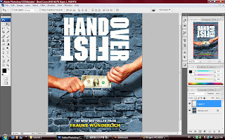
1)Open the book cover.tif.
2)press F for full screen view, and zoom in to 50%
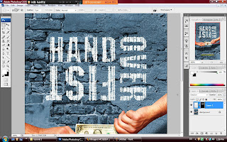
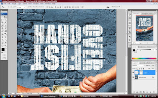
3)go to LAYER PALLET and click on PATH, click on the BOOK TITLE and it will show out the book title which is "HAND OVER FIST"
4)press the ctrl key and made the selection for the words.
5)back to the LAYER PALLET, and create a brand new layer.
6)make sure the foreground color is black and the background color is white, hold the ctrl key and press backspace to make the words become white color.
7)ctrl + D to de-select the words, and you will see the original white color words on it.

Wednesday, November 26, 2008

Project Charter for Assignment1 (Final Work)

Project Charter Assignment 1

Assignment 1 Title: “Malaysia, Truly Asia”.

Project Start Date:
20 November, 2008.

Project Finish Date: 28 November, 2008.

Project Manager:
Lau Sai Fong

HP: Please refer MMLS

Email: Please refer MMLS

Website: http://mcg1014-1071120519.blogspot.com/

Project Objective:
Since its earliest conceptualizations in the 1960s, multicultural education has been transformed, refocused, reconceptualized, and in a constant state of evolution both in theory and in practice. As an Asia Country which is Malaysia, is a beautiful country with rich culture waiting to be explored. And I would like to create a multi-cultural post card to represent a passion country - Malaysia.

Approach:
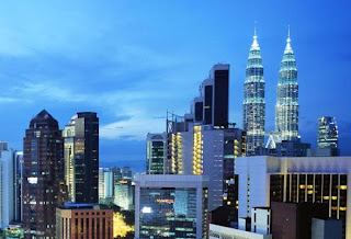
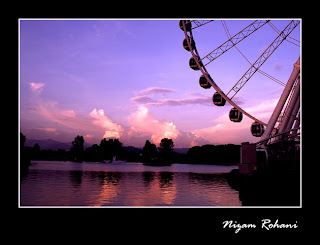
I would like to create a multi-cultural post card by using the scenery from Malaysia which is day time, evening time and night time of Malaysia as my background. The purpose that I used that scenery as my background is to show out the different visual senses of Malaysia.

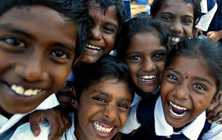
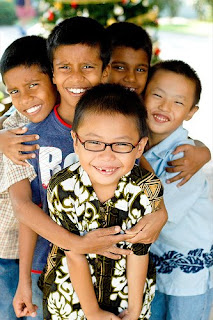
Beside the Malaysia’s, I also apply some kind of children smile's picture on it. I was taken four different races of children smile's picture which represent four type races in Malaysia.

The tool that I using during I modify my post card is tool of brightness/contract, Gaussian Blur, stroke, color, hue/saturation, text (font and etc), blending skill which is feather and gradient and others function tool.


Roles and Responsibilities:
I will start my work on 20 of November for my research images. And the continuous day I will start to modify my post card in Photoshop CS3. 25 November is my proposal of my assignment 1, and I show out my first stage of my assignment to my tutor. And 28 of November is my submission of my Assignment 1.

1. “Students are to submit the original PSD files (DO NOT FLATTEN THE FILE) together with the images used in the postcard. Call the file StudID_asssignment1.psd”.

2. “Place the files in separate folders. One folder containing the PSD file called Postcard. The other images used are to be placed in a folder call Postcard_ref”.

3. Print the postcard. Postcard size is 6x8 inches with 300 resolutions.

Comment: Photoshop is totally different with Illustrator... But I will try my best to accomplish those hard works.


And the picture at the below is my reference: